Redesigning Grab Food App

This was research done for a UI/UX module in Digipen where the goal was to research existing mobile applications and improve on them. This was a 4-person group project. Members include Me (Tan Jia Jing), Pei Shan, Charmaine, and Deandra.


Each of us will have a problem statement to work on. As I have taken a similar module during my Specialist Diploma course, I guided the team on this project, teaching them how to do proper flow charts, empathy maps, usability testing surveys and etc.  I was also in charge of creating the low and high-fidelity mockups, Figma Prototype, and the user flow.


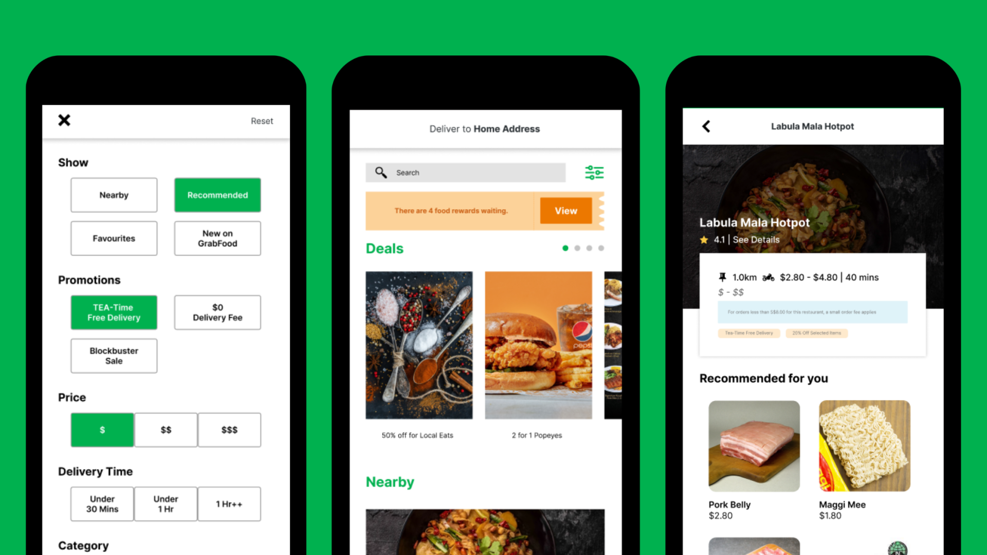
Problem Statement: GrabFood Application is not user-friendly and not intuitive.

Task

Research Documents, Style Guides, High Fidelity Mockups

  • Strategy

    UX Strategy

  • Design

    UI/UX Design, Mockups

STEP 1: USER RESEARCH

Product Vision

We began by listing down problems in the existing application that can be improved on while using other competitors like FoodPanda, WhyQ, and Deliveroo.


As a start, we conducted a heuristic evaluation on GrabFood with other competitors. We then move on to identify our users and create user personas and user flows to lay out the improvements we can make to the application. We will then make our low-fidelity mockup with the improvements in mind so that we can start conducting software testing to see if our improvements were valid.


Here’s the link to the:

STEP 2: DEFINE

Pain Points

With all the user research done, we have identified these main pain points with GrabFood.

  • Users have difficulty choosing their food

Because the menu doesn’t have menu photos and users cannot access the review page despite having restaurant ratings

  • Users are discouraged from using promotions

Because users can access unredeemable promotions.

T&C is too cluttered, hence users cannot get important details.

  • Users have difficulty searching for food that meets their needs

Meaning users can’t filter food by category, price, delivery time, or rating.

  • Details are not up to date or not shown until searched or prompted.

STEP 3: IDEATE

What If?

  • We believe that if we have a filtered search feature,

Then users will take less time finding what they need.

We will know it’s true when we see users spend a shorter time using the app.

  • We believe if we provide restaurant and their menu item ratings,

Then users will be courageous to order food.

We will know it’s true when we see the increase in conversion rates in the same menu.

  • We believe if we provide relevant details upfront

Then users will take less time on the app.

We will know it’s true when we see a decrease in error messages displayed to the user.

Wireframing

With the ideation done, I started on the low-fidelity mockups together with creating a style guide.


As there will be multiple people working on this project and it is an existing application, a style guide will be appropriate here. This will help keep the assets consistent and keep it true to the company’s branding.


Here’s the link to the:

STEP 4: USER FEEDBACK

AB Testing

Because of the limited time we have, we conducted A/B testing instead of going into in-depth usability testing.


A/B testing, also known as split testing, is the process of comparing two different versions of a web page or email to determine which version generates more conversions.


Thanks to that, we have several received responses and make iterations to the wireframes quickly which in return create better versions of the interface and experience for the application.


Here’s the Google Form together with the responses we have gathered from our testing sessions.

FINAL PRODUCT

High-Fidelity Mockups & Prototype

After several iterations, I moved on to creating the high-fidelity mockups and prototyping on Figma.


Here’s the link to the:

chrome_6U0TSI3ub2

REFLECTION

Takeaways

Some things I have learned after finishing this project are that:

  • Keep calm and have an open conversation with everyone

Since we had to work on this project at home, everyone will be on a voice call or text, so sometimes, especially when we realized we are missing content, we will make rash decisions without consulting the team members first. Because of that, we had disagreements which can be avoided if there’s open communication.

  • Focus more on Interaction

As we are on our phone most of the time, the use of micro-interactions is key to giving a pleasant user experience since they provide better connectivity between user and interface. Because of limited time and skills, we did not explore more on that despite wanting to.

  • The importance of Clean UI

With UI trends going in and out of season, Clean UI keeps on dominating the trend because of its clearness and lightness. Thus, for this project, we ensure the UI reminds this way without sacrificing the flow and content to the user.

Post a comment

Your email address will not be published. Required fields are marked *