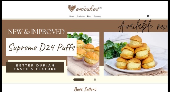
Redesigning emicakes

This was research done for a UI/UX module in Digipen where the goal was to research existing mobile websites and improve on them. This was a 6-person group project.


Our chosen topic is to redesign the emicakes website as we find the website inconsistent and messy in general.


I am in charge of creating the paper prototype and conducting usability testing. I am also in charge of creating the style guide and guiding the team in creating the low and high-fidelity mockups using Figma due to my experience, working as a self-hired UIUX Designer cum Web Developer. I also created the banners for the prototype using Canvas.

Task

Research Documents, Style Guides, High Fidelity Mockups
  • Strategy

    UX Strategy

  • Design

    UI/UX Design, Mockups

STEP 1: USER RESEARCH

Findings

We began by listing down the problems we found in the existing websites that can be improved while comparing them to other competitors such as Baker’s Brew.

Here are the main problems we uncovered:

  • A lack of product filtering
  • The navigation bar was confusing with too much information
  • Too much clutter with information scattered around the website
  • Products had lack of important information such as allergens or did not display them in a user-friendly way
  • The cart page lacked important information like prices of add-ons per cake

After identifying the main problems, we proceed to identify our users and create user personas, user flows and empathy maps to lay out the improvements we can make to the application.

Here’s the link to the:

STEP 2: BRAINSTORMING

Solutions

With the main problems identified, we decided to make changes to the layout, as well as add some new functionality.

Here are the changes:

  • simplified the navigation bar
  • sorting of the items into their relevant category
  • Allergen Information added to items and appropriate pages
  • Details of cake add-ons will be added
  • Filtering system that allow the users to quickly find products based on a set of categories

STEP 3: PROTOTYPING

Wireframing

With the ideation done, I started on the low-fidelity mockups together with creating a style guide.


As there will be multiple people working on this project and it is an existing application, a style guide will be appropriate here. This will help keep the assets consistent and keep it true to the company’s branding.


Here’s the link to the:

STEP 4: USER FEEDBACK

User Testings

After completing the prototype, my team and I conducted user testing on participants that fall under the personas.

When conducting user testing, they are given multiple tasks:

  • Purchase the best-seller chocolate cake
  • Look through all the products on the website and purchase a cake of their choice

The purpose of this task was to observe if participants understanding on how to make use of the filter, as well as general observations on the flow of purchasing a product.

FINAL PRODUCT

High-Fidelity Mockups & Prototype

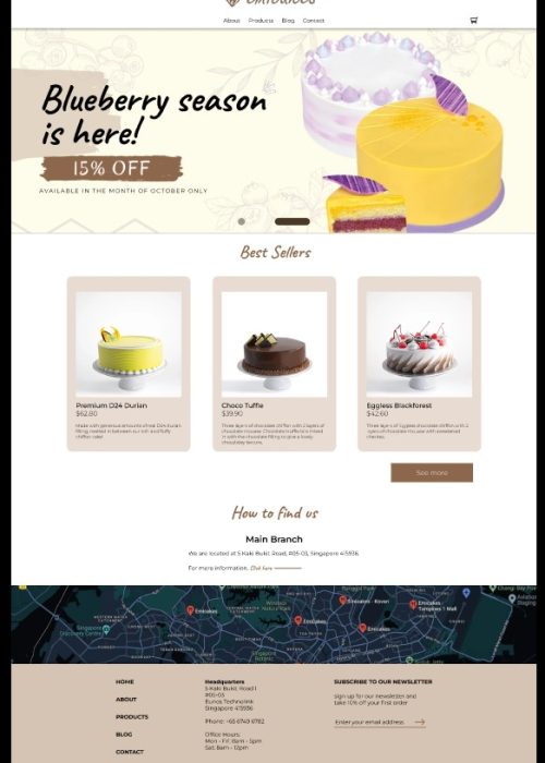
After several user tests and iterations based on it, I moved on to creating high-fidelity mockups and prototyping on Figma.


Here’s the link to the:

Emicakes Final Product

REFLECTION

Takeaways

Some things I have learned after finishing this project are that:

  • Good Cooperation

Despite the rush, my team and I were willing to extend a helping help to one another without any hesitation which kept our morale high and aided us in powering through.

  • Proud of our work

We like how the final product looked like and what we have accomplished this far.

  • Lack of Time

As there are multiple projects, we fail to keep to the initial schedule and caused some bottleneck issues that hindered our progress. As such, we ended up having to rush some of the work to meet deadlines

  • Disconnected Work

As we split the task individuals due to the point above, this causes some inconsistencies that we had to spend time ironing those out instead of refining the prototype

Post a comment

Your email address will not be published. Required fields are marked *