Editing Sims 4’s UIUX

This was the research done for a UI/UX module in Digipen where the goal was to research existing games and improve on them. This was a 6-person group project.


Our chosen topic is to redesign the Sims 4 as we find the game overloading the player with information while not having enough feedback or information in others.


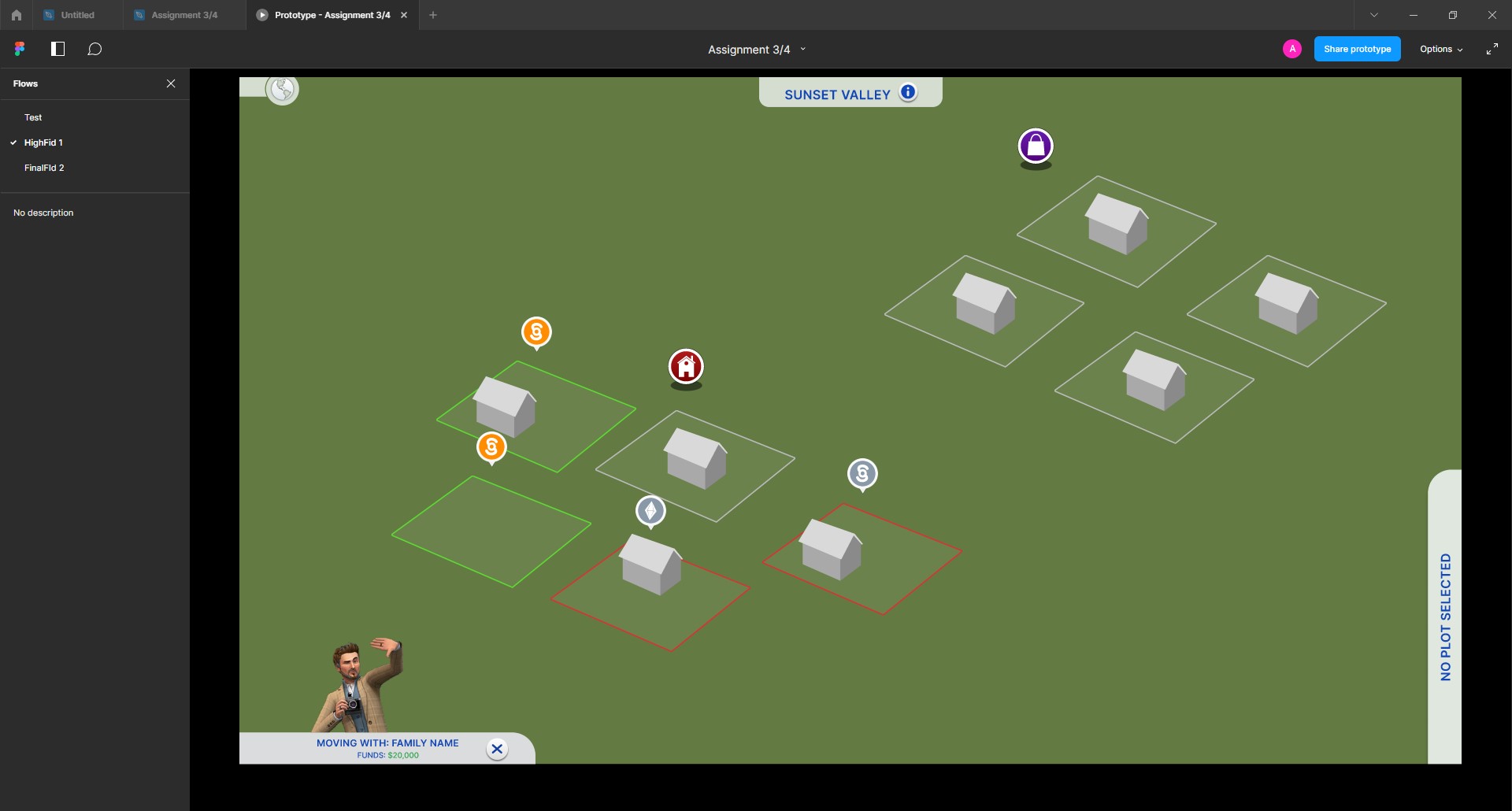
I am in charge of creating the paper prototype and conducting usability testing. I am also in charge of creating the paper prototype, conducting usability testing, and guiding the team in creating the low and high-fidelity mockups using Figma.

Task

Research Documents, Style Guides, High Fidelity Mockups

  • Strategy

    UX Strategy

  • Design

    UI/UX Design, Mockups

STEP 1: USER RESEARCH

Findings

We began by listing down the problems we found in the existing websites that can be improved while comparing them to other competitors such as Baker’s Brew.

Here are the main problems we uncovered:

  • The map contains many UI elements which may be confusing for new players
  • Some feedback is unclear, for instance, no indicator when selecting a lot of lands
  • Some information is lacking which could be useful for newer players

After identifying the main problems, we proceed to identify our users and create user personas, user flows and empathy maps to lay out the improvements we can make to the application.

Here’s the link to the:

STEP 2: BRAINSTORMING

Solutions

With the main problems identified, we decided to make changes to the layout, as well as add some new functionality.

Here are the changes:

  • Better Feeback for instance when selecting lots
  • More game information
  • Miscellaneous UX Changes like lot details are docked on the right with the move-in buttons and players don’t have to move their mouse to the other side of the screen to access these different functions

STEP 3: PROTOTYPING

Wireframing

With the ideation done, I started on the low-fidelity mockups.


As there will be multiple people working on this project and it is an existing game. the use of style guide and components does help in keeping the mockups consistent and does aid in rapid prototyping.


Here’s the link to the:

STEP 4: USER FEEDBACK

User Testings

Similarly to the previous project – Redesigning Emicakes, after completing the prototype, my team and I conducted user testing on participants that fall under the personas.

When conducting user testing, they are given 1 task:

  • Purchasing their very first lot in a brand-new save file

The purpose of this task was to observe if testers who are regular/brand new in the Sims 4 can understand how to make use of the map available for them to purchase a lot of their choice.

FINAL PRODUCT

High-Fidelity Mockups & Prototype

After several user tests and iterations based on it, I moved on to creating high-fidelity mockups and prototyping on Figma.


Here’s the link to the:

REFLECTION

Takeaways

Some things I have learned after finishing this project are:

  • What went right

Proper organization of wireframe elements made the prototyping process fast, as changes could be easily made.

Our tasks were properly distributed, meaning that each member could work on their respective tasks without any overlaps – making work efficient. On times when there were bottlenecks (e.g, documentation waiting on survey results/prototype wireframes) – the respective members hopped on to help with the other tasks.

We reduced our scope to a much more manageable size, allowing us to focus more on polish.

  • What went wrong

A lot of the work was crunched out, which meant that each iteration could only contain small changes. It also resulted in us having lesser time to address feedback or make any final changes. Having a detailed task list and deadlines would have helped mitigate this.

Post a comment

Your email address will not be published. Required fields are marked *